Fulfillment Experience on
McDonald’s Global Mobile App
Interaction Design Intern @ Method, New York | Summer 2017
Team
4 people (PM, IxD, VisD, Prototype)
Role
IxD
Duration
3 months
Deliverables
User studies insight
Wireframes
Prototype (click-through)
Method has been working with McDonald's for more than 3 years. In the summer of 2017, I interned at Method New York and helped the McDonald's Global Mobile Application (GMA) team with design iterations on McDonald's mobile ordering experience.
Project brief: Redesign the Acceleration-Fulfillment Experience
In McDonald's Global Mobile Application (GMA), users are required to select pick-up time and location before ordering. This process is referred as "fulfillment". The Acceleration project aimed at building quick iterations and modification for several features in the McDonald's GMA app, based on users' feedback.
Challenge
The current App requires 3+ steps in the fulfillment part before users start ordering. A long fulfillment process would bring negative experience in ordering, and decrease the amount or orders/users potentially.
Simplify the user journey
The decision was to redesign the fulfillment process as defaulting users to a time period and store, enabling users to start ordering as fast as possible. The decisions were based on data provided by the client.
When ordering food with mobile app on the old version, users are asked for the day part and to select store for pick-up. However, based on the data collected by the client, 85% of the users pick up their order within 20 minutes of placement, and 80% of the users go to the same store every time. This led to the decision of defaulting users to the current day part and a store and enabling users to start ordering as fast as possible.
Considerations
As part of the team, my role was exploring the flow in different scenarios, including designing how does the app default a day part and a store, default to which store, how to notify users, when to notify, and how would a user change a day part or store. Considering of all the user cases and corner cases, locally and globally, here are the solutions for 1st time users and Nth time users.
Design proposals
First time users
For 1st time users, we default them to the nearest store when the location service is enabled. If not, the system would ask users to allow location service and notification as requirement for ordering. Also, the APP will show notification to notify new users the default settings.
The design of the notification banner refers back to the design style guide the team had developed for McDonald's. The appearance of the banner, as well as the animation of it being pushed from the top center are both existing design patterns.
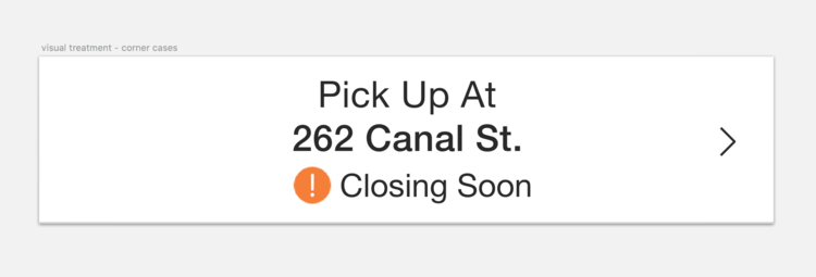
There were also considerations of corner cases in various scenarios of defaulting to a store:
The store is closing soon: Visual treatment - Showing the "!" icon near the default store's name
The store is closed: Default to the next nearest store
The store is permanently closed: Default to the next nearest store
Nth time user
For Nth time user, the process is different and more complicated.
Recommend: Default to the last visit store
We recommend to default users to the last visit store, based on the data that 80% users usually go to the same store every time. However, this setting is market configurable. If there was data from a specific market, say UK market, that users actually tend to go to their favorite store more, this local market can change the default setting as they decide.
No push notification banner for visited stores
Since the default is a store a user has visited, the APP will not push the notification banner. Unless the original default store is closed or permanently closed, then the APP will default users to the next nearest store, and a notification will be pushed if it is a new location.
Change the pick-up time and store
If a user would like to change the store location or pick up day part, they may tap on the top part on the order wall and land on when& where page. From there, users can change settings and go back to order wall. I helped with the team explored around this process, and ultimately decided on the design.
We also enable users to search stores in map view and directly order from there:


